Modernizing content editor with atomic blocks
Overview
SnapComms, an Everbridge company, provides internal communication tools for corporate organizations. The content editor is the core loop of that product. Everything a customer wants to achieve passes through it.
I joined as Senior UX/UI Designer, working alongside a product manager, a UX researcher, QA, and a front-end team. I owned UX strategy, UI design, data analysis, customer interviews, wireframing, Figma prototyping, and testing on the live product. I also led the design system the new editor is built on.
Drag to compare the old editor with the redesign
A cumbersome editor was capping growth
Customers could not create mobile-friendly rich media content without help. That pushed people into support, stalled trials, and made self-service onboarding impossible.
Challenge
Creating rich, responsive content took more effort than most customers were willing to spend, and most of them were not designers.
Approach
Move from a freeform page canvas to an atomic block model, driven by research findings rather than assumption.
Goal
Make the editor self-explanatory enough that a trial converts without a support conversation.
Outcome
24% more trial conversions, 21% more content units created per user, and a third fewer support tickets.
Five sources of evidence
Customer interviews
With our UX researcher I targeted active publishers through Pendo and booked them via Calendly. A semi structured script tested 10 assumptions across 17 questions, and I asked people to build real content in front of me rather than describe it.
Trial session recordings
I reviewed dozens of Hotjar recordings of trialists opening the editor for the first time, logging every point where they stalled, backtracked or abandoned the task.
Product analytics
Pendo showed which features were actually used and which were ignored. That decided where to dig in interviews instead of guessing.
Support tickets
The product manager and I exported every Salesforce ticket mentioning content editing. The recurring themes matched what I was seeing in the recordings.
Competitive teardown
I pulled apart how Squarespace, Mailchimp and Wix handle block based editing, because many of our customers already used those tools every week.

Tested as a prototype before a line of code
I built the model as an interactive Figma prototype and ran a step by step script with participants from the original interviews plus new trialists screened in Pendo. Block categories were renamed, icons redesigned and tabs relabelled off the back of that, all before development started. It also gave the front end team something concrete to push back on early.
What changed in the editor
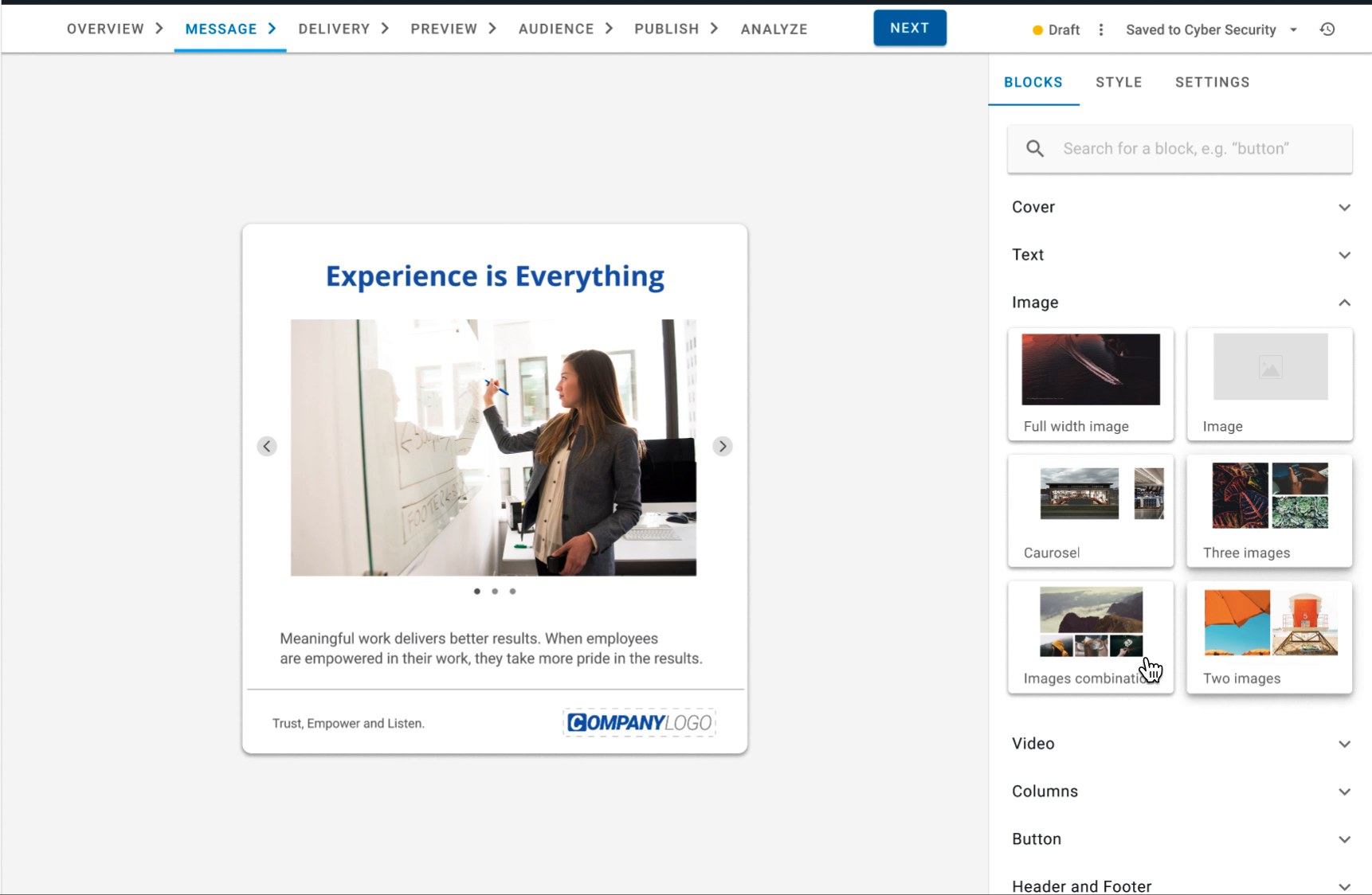
Navigation follows the life of a message
Features had accumulated in whichever corner of the product they were built in. Working from the interviews, I reorganised the editor around the stages a message actually goes through, so people always know where they are and what is left to do.

Rebuilding it without stopping the product
A rewrite this size could not ship in one release. With the Chief Product Officer I sequenced it into milestones, each one shippable on its own and each one a chance to test the concept against live users before committing further.
01
Validate with templates
We shipped layouts built from atomic blocks as ready made templates first. Customers used them before we touched the editor itself, which told us the model held up in real accounts.
02
Sidebar in the questionnaire editor
The contextual sidebar went live in one contained surface first. Real users, real content, and no need to rebuild the whole editor before we could learn from it.
03
Convert existing elements
Text and images became configurable blocks with padding, background, alignment and device visibility, so the old canvas turned into the new model piece by piece.
04
Retire Designer mode
Once block settings lived in the sidebar, the separate Designer mode had nothing left to do. Adding a block became a plus button between blocks.
Staged rollout
Rather than rebuild everything at once, the contextual sidebar shipped first inside the questionnaire editor. A contained surface, real customers, and enough signal to justify the larger rewrite.
What changed after launch
These come from the product analytics we tracked before and after the changes went live, not from a survey.
More trial conversions
Fewer trials stalled on the editor before reaching a paid plan.
More messages per user
People published more once building a message stopped feeling like a project.
Lower support load
Editor related tickets dropped by a third once the interface explained itself.
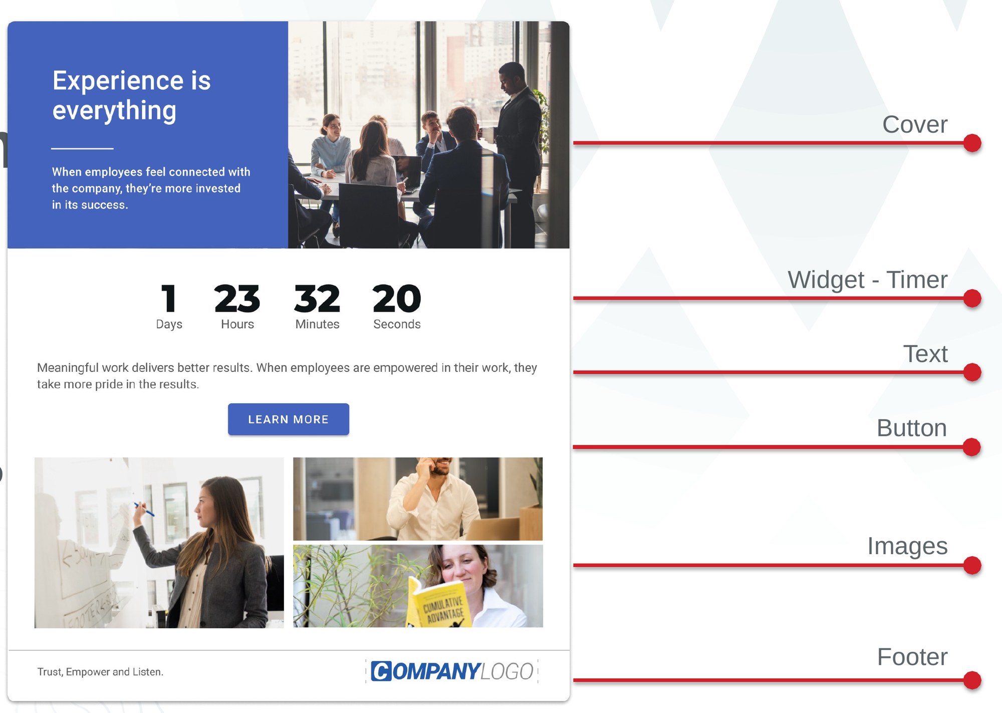
Blocks in the library
Cover, text, image, video, columns, button, header, footer, ticker and form. Each one ships with its own mobile view.
Let's chat
I’m always open to meeting fellow designers, product leads, or anyone passionate about the intersection of design and technology.