Redesigning search and filters to keep trial users
PredictHQ sells event intelligence to companies that need to forecast demand. Retailers, airlines, delivery networks. Event search is the first thing a trial user touches, and it had not been reworked in years while the business around it changed completely.
I was Senior UX/UI Designer on the project, working closely with the tech lead. I ran the research, orchestrated the redesign, supported developers through building it. The free trial is how the company generates leads, so a confusing first experience of searching for events costs real money.
Filters are a trap in both directions
Filters set hard boundaries. Offer too few and people drown in irrelevant events. Offer too many and they land on zero results and leave. The old search sat badly on both sides: eight filters visible by default, none of them applied until you pressed a separate Search button, and an export control tucked away from everything it related to.
Trial users were the ones paying for it. They arrive without a mental model of the product, run one search, and decide. A bad first search reads as a bad product.
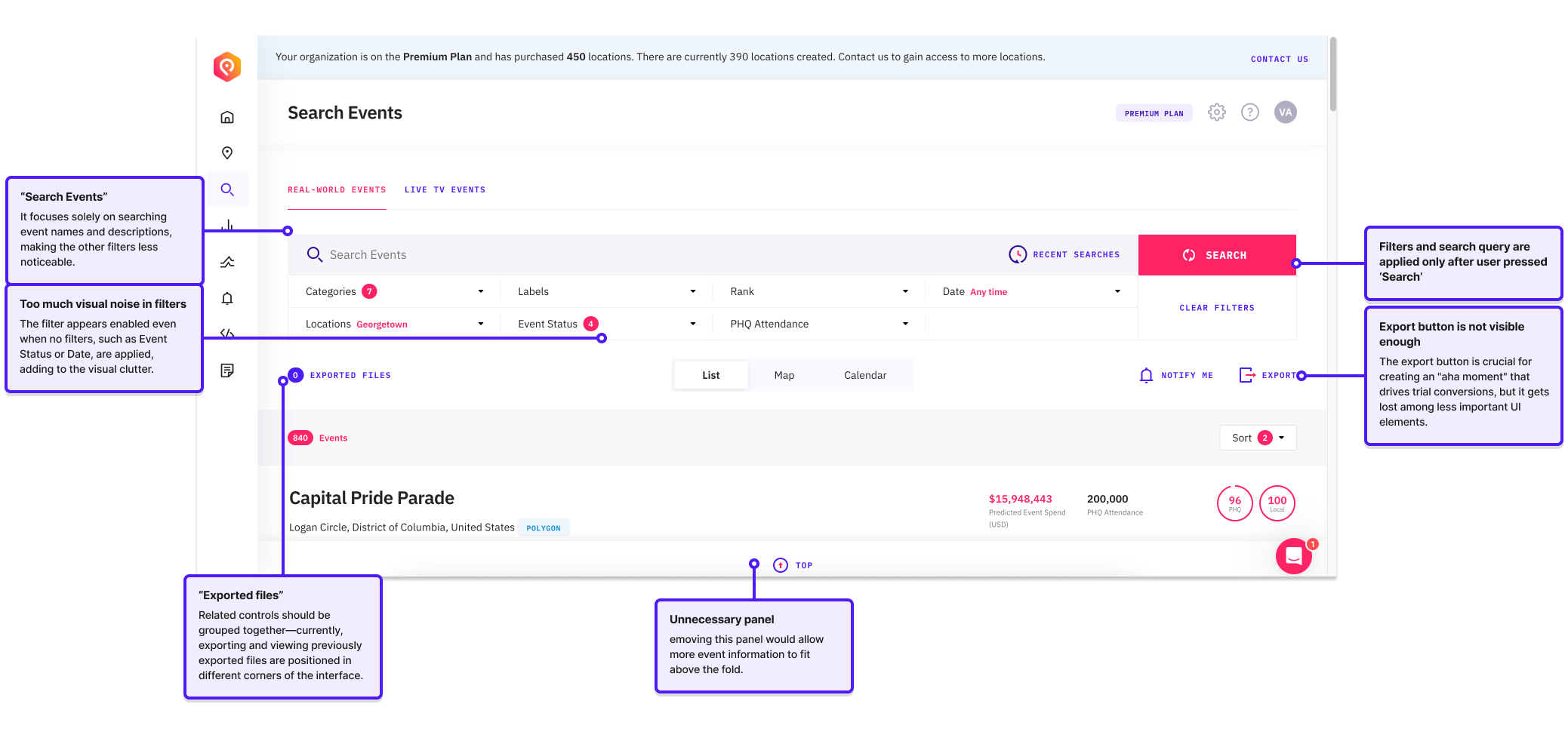
Four sources, one picture
Before designing anything I wanted the problem described four different ways. I started with Vitaly Friedman's research on filtering patterns so I was not reinventing solved problems, then went looking for what was specific to us.
Eight moderated sessions
Run over Zoom, recruited through our network and paid in Uber Eats vouchers. Each person signed up, found a specific event, filtered to something useful, and exported it.
Behavioural analytics
Which filters people actually touched, and which sat unused, pulled from Heap, which records every click automatically so past behaviour can be queried without defining events in advance.
Stakeholder interviews
Frequent users, plus developers, marketing, product and the CEO, so the requirements reflected the business as well as the sessions.
Seven of eight participants typed a new location into a field that only searched locations they had already saved. Every one of them got zero results and assumed the product had no data for their city.
What else the eight sessions turned up
Tested before anything was built
I put an interactive Figma prototype in front of some of the original participants and a few new ones. Short sessions, a written script, no ceremony.
Most people got through every task without help, and the CEO expanded the scope off the back of watching it. What it walks through is the three changes below, running end to end.
The three changes I proposed
Each one answers something the sessions turned up, and all three are in the prototype above.
One location field instead of three tabs
Street addresses, places and saved locations now resolve in a single field. The tabbed split existed because of how the data was stored, not how anyone searches. Saved locations still exist, they are just results in the same list rather than a separate tab you had to know about.
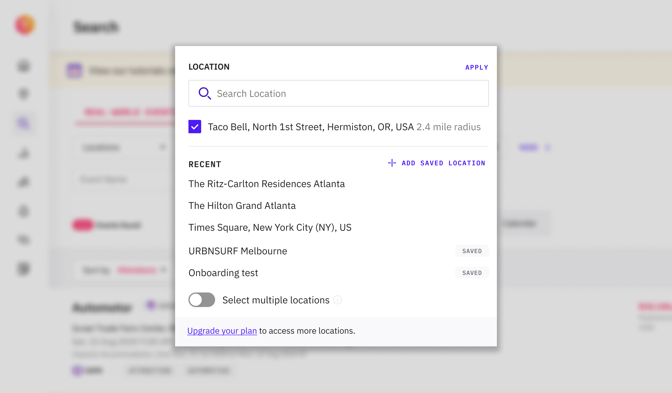
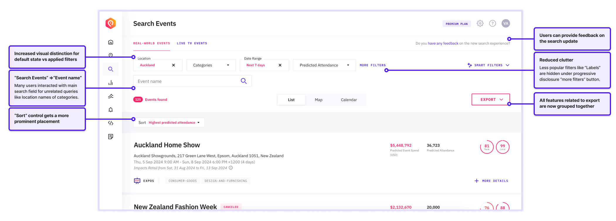
Filters apply the moment you change them
Results update immediately, so the boundary you set and the results you see never disagree. The separate Search button is gone. This was the hardest change technically, and the tech lead and I worked out what was achievable in the timeframe together.
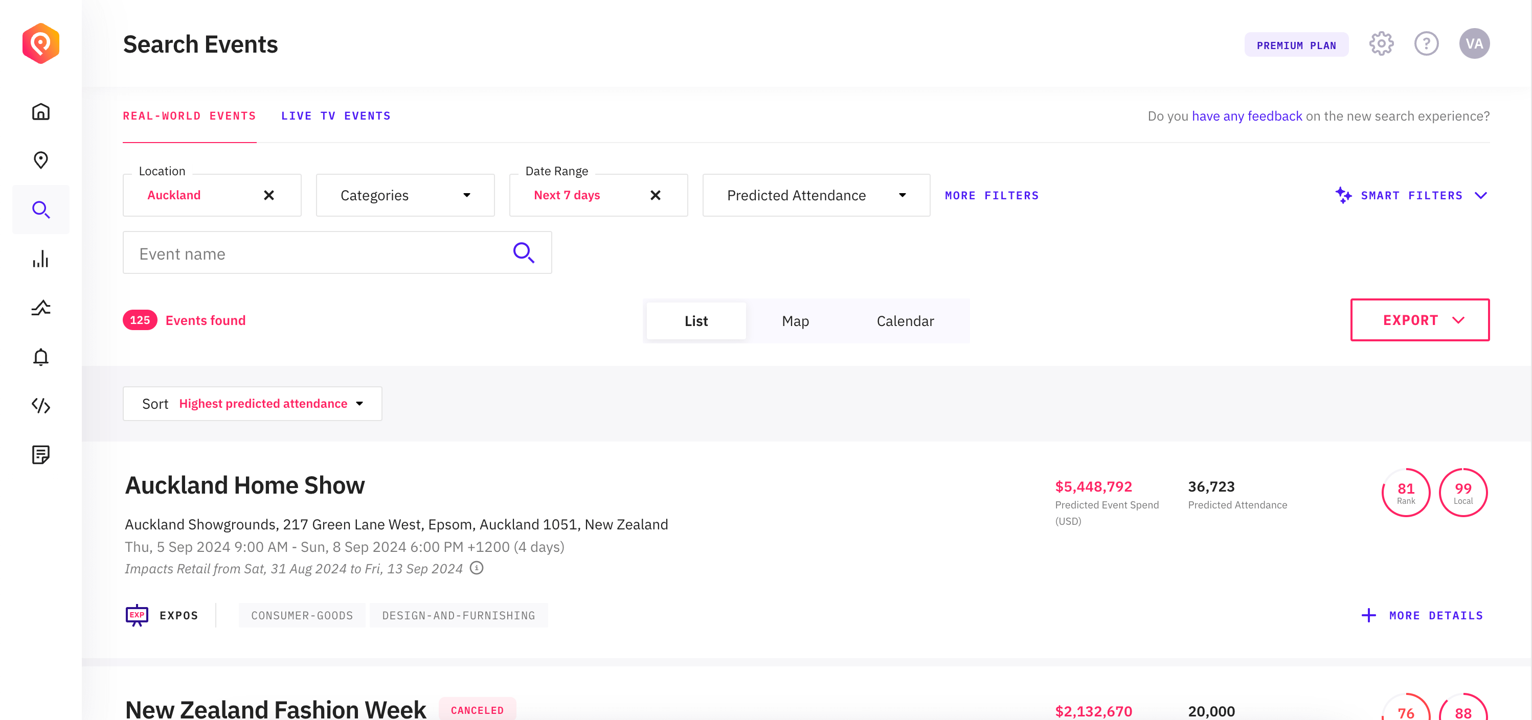
Fewer filters up front, the rest behind More filters
A new user sees four controls, not eight. Categories became groups you can toggle whole, instead of nineteen individual checkboxes, and tooltips carry the definitions people could not guess. Export moved next to the results it exports, and empty states now say whether it was the filters or a plan limit that returned nothing.
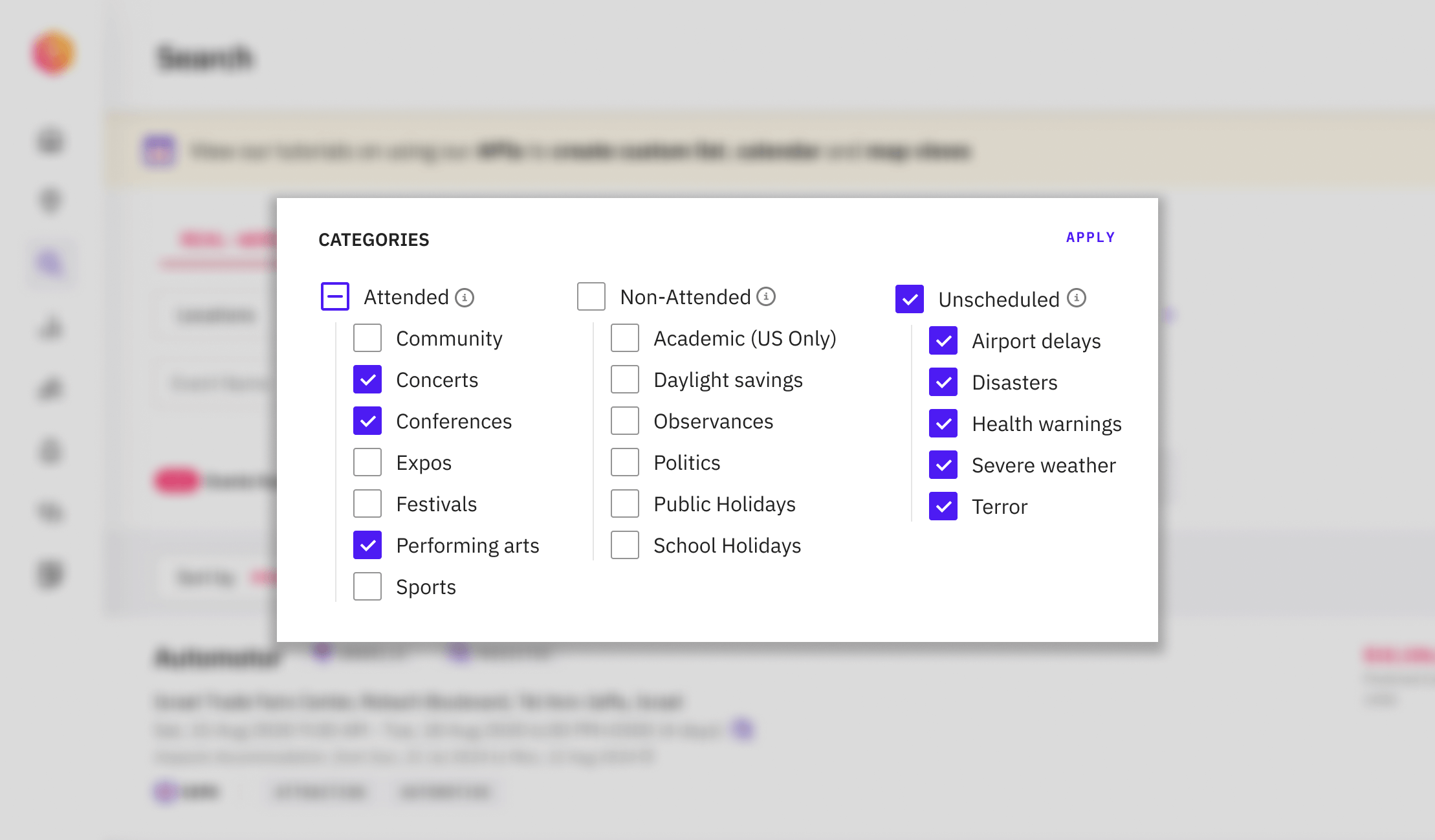
Trial users came back
People did not start using filters because anyone told them to. They used them because filters stopped being a commitment you had to confirm before seeing anything.
Better one-week retention
Trial users came back to search within a week of signing up
Of trial searches used filters
Up from 18 percent before the redesign
What I took from it
The lesson I keep is about ranking. My heuristic audit had the location tabs down as a moderate annoyance. Eight sessions moved it to the top of the list, because frequency of failure matters more than severity in the abstract.
Let's chat
I’m always open to meeting fellow designers, product leads, or anyone passionate about the intersection of design and technology.